POQ E-Commerce App
Brand Identity Design & Art Direction
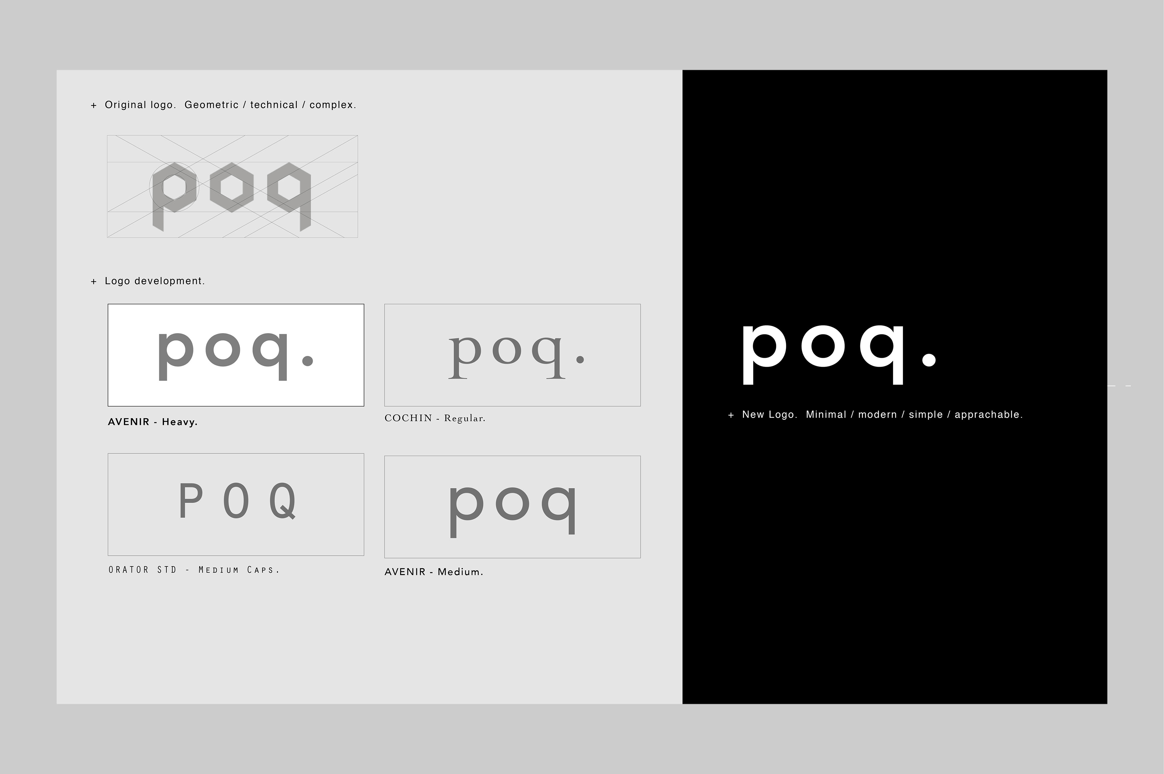
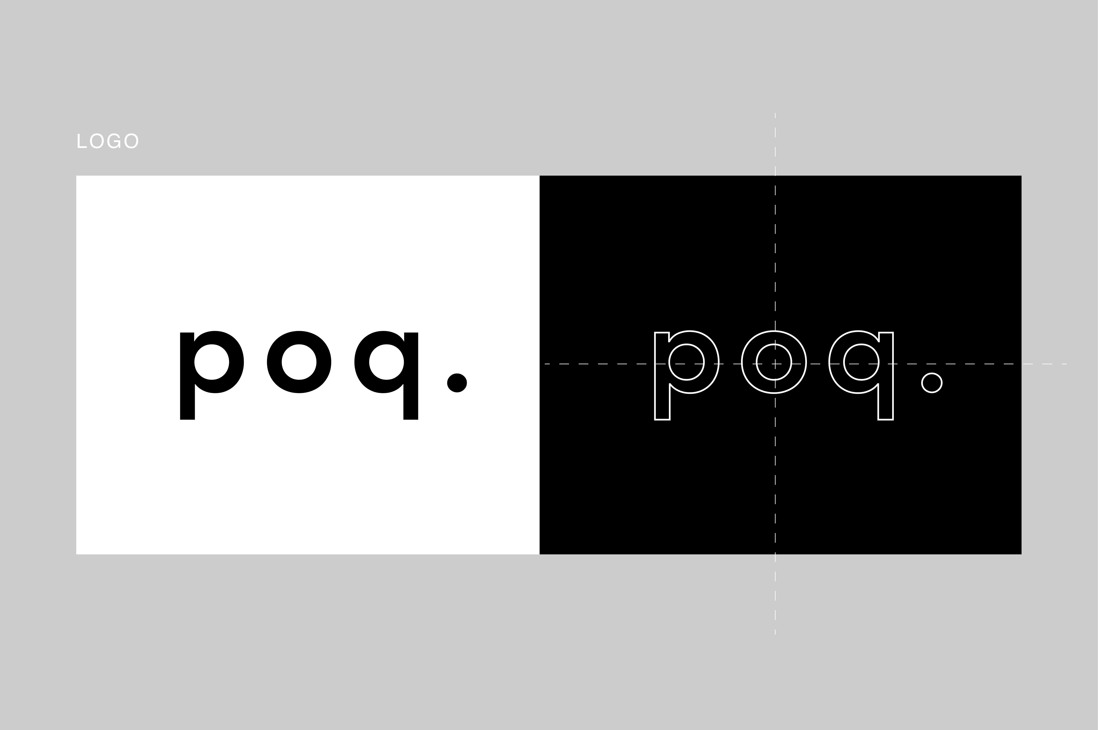
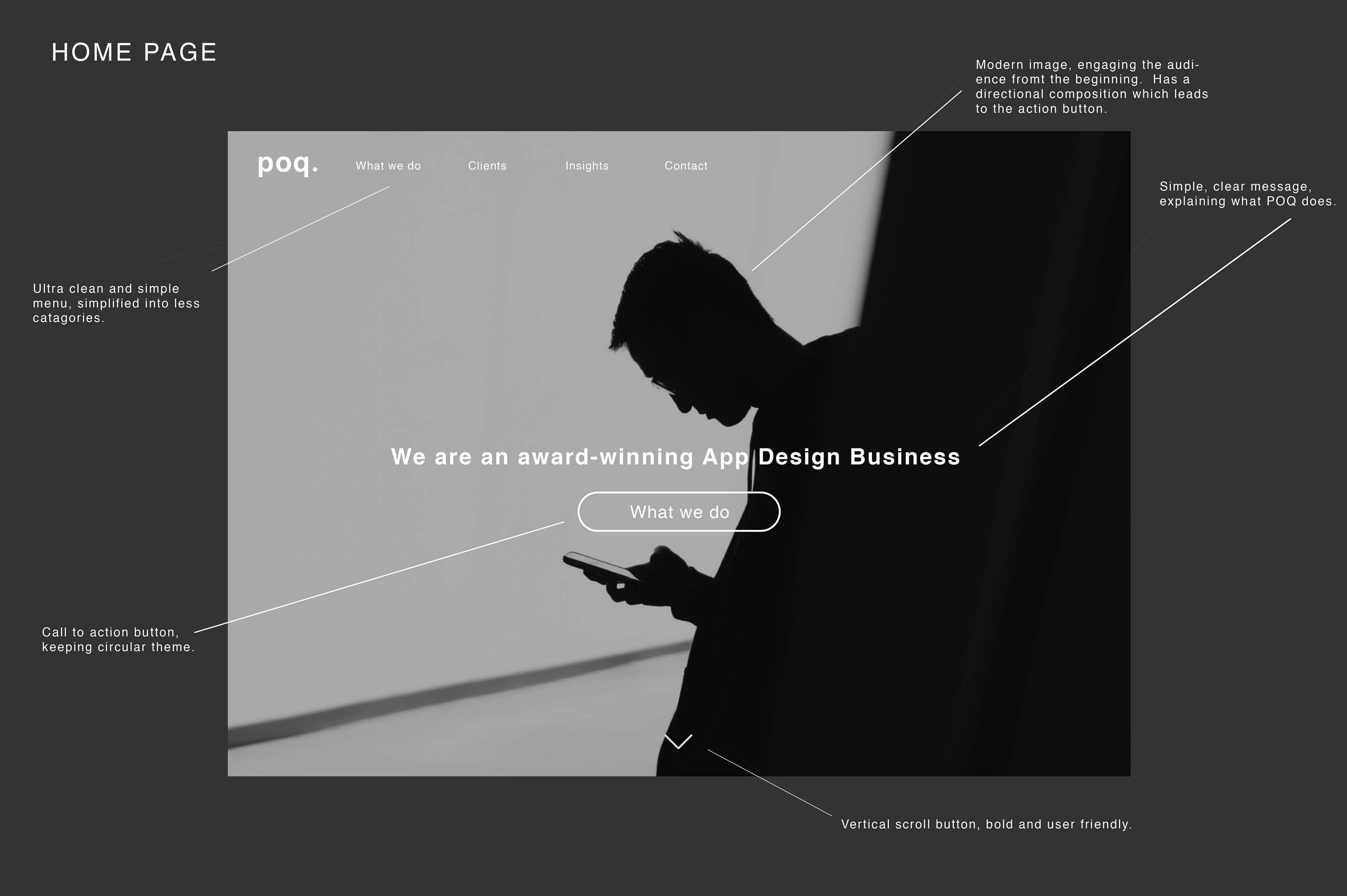
POQ approached me for a refresh of their previously tired and dated website - which looked like it was something straight out of the late nineties. The branding no longer represented this modern, and innovative tech company. I proposed to modernise, and refine their logo and branding - opting for a minimal and bold approach. With a symmetrical logo such a "poq" there were visual opportunities to play around with how the letters looked in lower case. The symmetry was then further embraced in the logo animation - where all letters seem to grow out of the "o". This was a fantastic opportunity for a moving image asset for the website. Overall the website feels fresh and in keeping with POQ's innovative approach to business.